Table
Overview
A table displays rows of data.
Anatomy
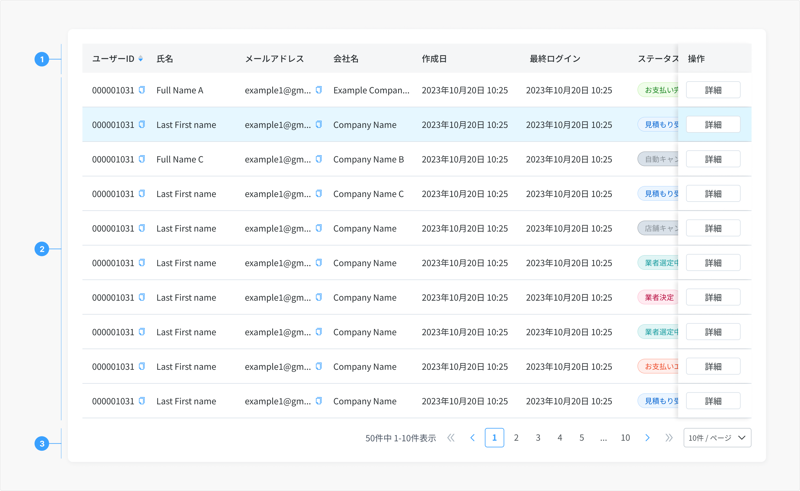
- Table header: The table header contains titles or labels for each column.
- Table Cell: The table cells are used to organize and display content, such as text, numbers, images, or other multimedia elements, within the structure of a table.
- Pagination: Lets a user navigate data as pages when the amount of data too large to be shown at once.
Type
Basic
By default, the selectable variant doesn't allow users to select more than one row in a data table simultaneously.
Selectable (Update later)
By default, the selectable variant allows users to select more than one row in a data table simultaneously. To select a row, the user must select the checkbox associated with the row. The user can select all rows at once by selecting the checkbox in the column header. Checkboxes in the rows have only two states, checked and unchecked. However, the check all checkbox in the column header has three states, check, unchecked, and indeterminate.
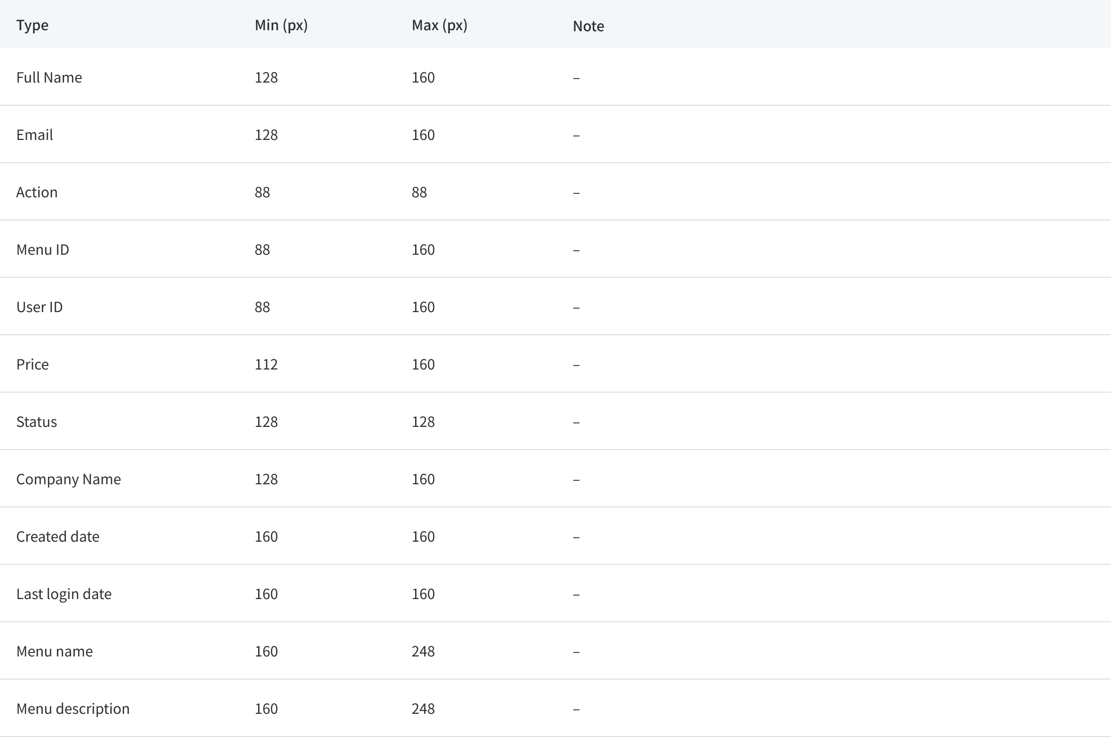
Column size
Rules
Behavior
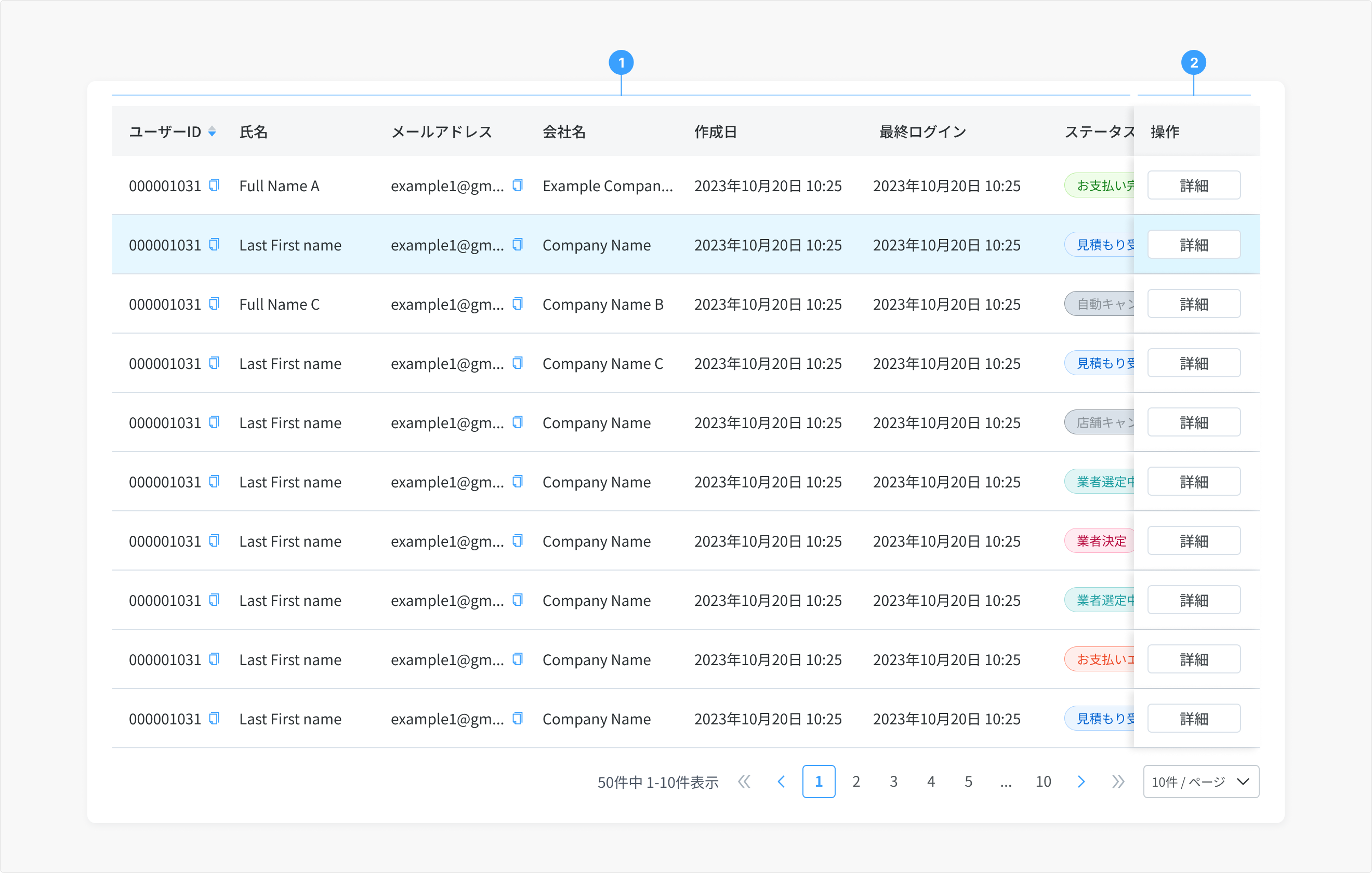
- Remaining columns: Users can scroll horizontally to view more information
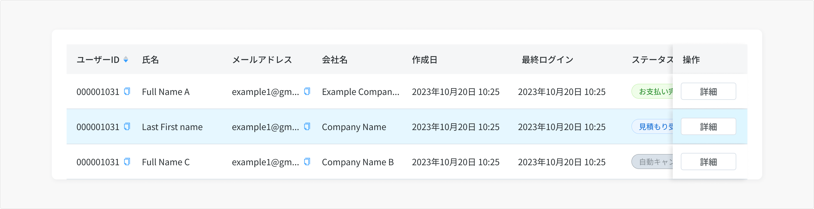
- Action column: The Action column will be fixed to the right when the table's width does not show all the information of the remaining columns.
Usage Guidelines
When To Use
- To display a collection of structured data.
- To sort, search, paginate, filter data.